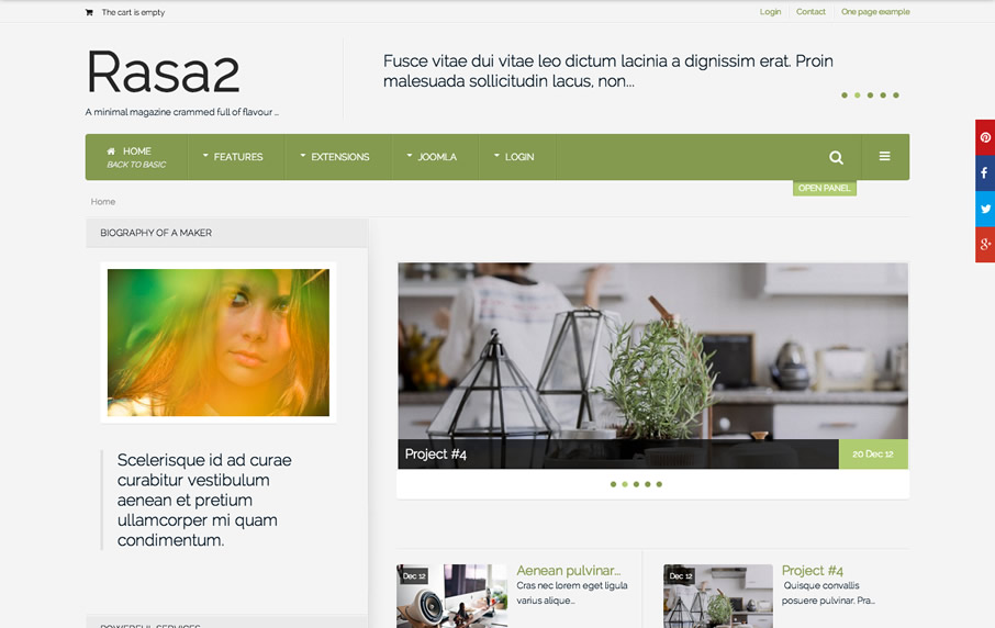
Rasa2
Joomla 3+ Template
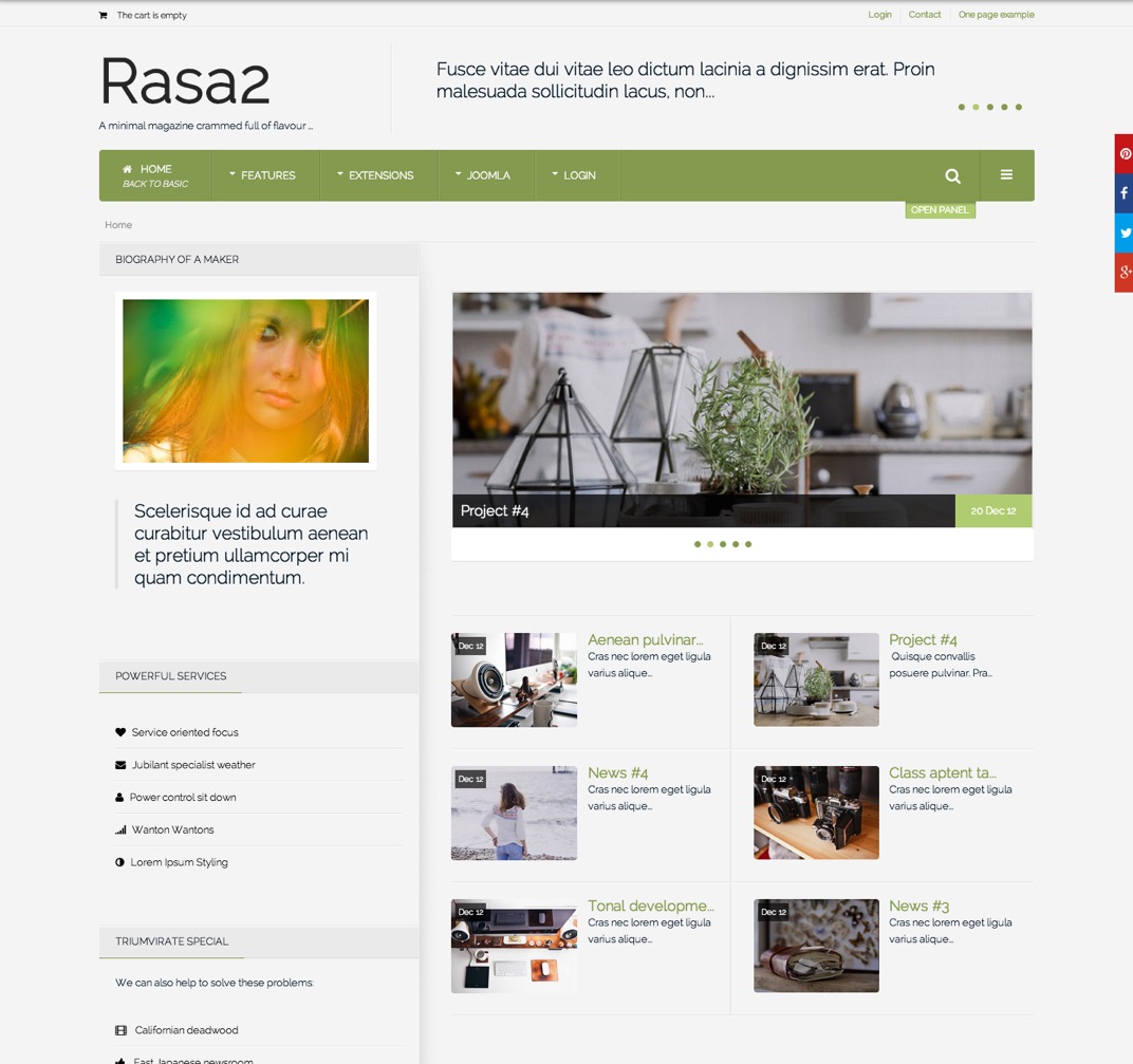
Rasa2 extends the original Rasa template that was released back in August 2011 and brings it into the responsive new world with a plethora of cutting edge design and performance features. Rasa2 is built on our brand new Joomla3 template framework which offers fast performance right out of the box, flexible theming tools, extensive responsive features, dynamic and intuitive interface and more. More
-
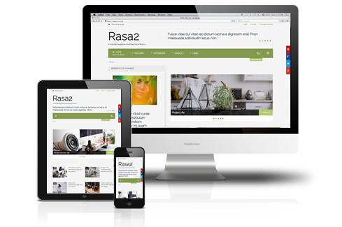
A super fast shopping cart theme ...
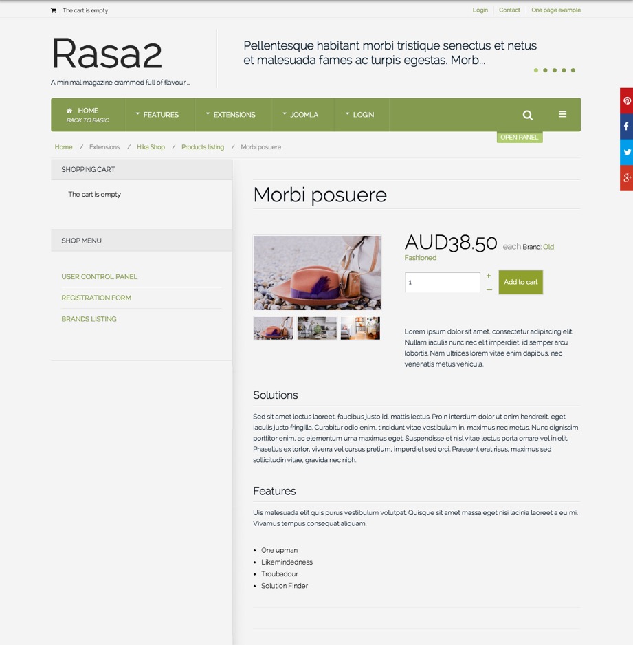
Rasa2 is an responsive ecommerce / shopping theme that comes with support for the Hikashop component. Hikashop has proven itself to be a rock solid and reliable solution for your Joomla ecommerce needs.
-
Clean, elegant and minimal design
Rasa2 is a stunning and simple design that is flexible enough for you to use in a magaqzine, corporate, news or ecommerce based website.
-
Diverse responsive tools
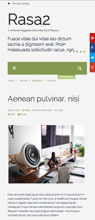
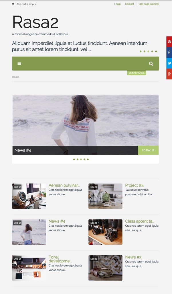
Rasa2 features extensive tools for controlling your website across various screen sizes. Choose from five different behaviours for responsive navigation, easy access to template breakpoints, built in support for php mobile detect and more.
-
Easy theming
Rasa2 features an extensive list of theming tools to help tweak colours and layout variables used in the template. It's built in less compiler quickly and easily processes any changes.
-
Selective Bootstrap support
Bootstrap is not required for the Rasa2 template to operate with basic Joomla content views however if you need Bootstrap you can use our selective implementation tool to add the various required bootstrap elements to your design. It's easy to add your required bootstrap elements without adding the entire bootstrap library.
-
Draggable Layout tool
Easily create and control your layouts using our draggable layout tool. It's easy to get a visual representation of your site's layout via the layout tool which allows you to hide publish and control modules with an easy to use draggable inetrface.
-
Extensive fonts available
This template allows you to choose from a wide variety of fonts. It's easy to add to the core font stacks with any of the fonts listed on the Google web font directory. With new fonts added every week the sky is literally the limit.
-
Compatible with Zenkit and K2
This template is compatible with K2 via our stand alone responsive templates for K2 that we call Zenkit. Zenkit is a collection of responsive slideshows, carousel, filterable grid, accordion, blog and magazine layouts that can be easily applied to your K2 content.
-
All in one Zentools module
Zentools is a powerful tool for creating responsive grids, slideshows, carousels, accordions and more. It provides all the functionality you need to populate your site with stunning and flexible responsive layouts using images from a folder, your Joomla or K2 content.
-
Offcanvas, megamenu and accordion menus
Rasa2 also features a range of menu tools for creating dropdown, vertical, accordion and offcanvas menus. The Zenmenu plugin makes it possible to add icons, subtitles and multi-column menus to any core Joomla menu module.
-
Baked in CSS3 animations
You can easily add fancy fading, sliding and bouncing affects to entire rows of your content using the built in css3 animation tool. Adding animations to your Joomla template has never been easier.
-
Back to top, Sticky Nav and Lazyload Image
Other fancy features also include a native back to top button, the ability to pin the navigation to the top of the page when the user scrolls down the page. Lazyload offers the delayed loading of images on the page to help speed up page loads and reduce bandwidth for your users.
-
Connect your social networks
Rasa2 also offers the ability to connect your site to your social networks. Add social sharing for facebook, google plus, pinterest and twitter at the click of a button.
-
Developer friendly tools and architecture
Rasa2 also features a vast range of tools to offer customisation of javascript, css and less. Easily eadd new scripts, control the loading of assets and more.
-
Built in One page mode
Rasa2 also features the ability to create a simple one page smooth scrolling design. One page make it possible to use your main navigation to scroll to specified anchor points on your page. One page mode works perfectly on mobile devices via the offcanvas or toggle menu options.

| < Prev | Next > |
|---|

